Restoring the balance: why the United Nations (UN) adopted the Togo-Equal Earth Projection (TEEP) world map
Led by Togo, 164 nations vote to correct the global map, while only the United States votes against.
As leaders in global social work and social development, the International Association of Schools of Social Work (IASSW), the International Federation of Social Workers (IFSW) and the International Council on Social Welfare (ICSW) have a responsibility to ensure their own visual identities reflect the equity they promote, starting with the maps they choose to represent the world.
The world map most people grew up with is the Mercator projection, a design from 1569 in which Greenland appears roughly the same size as Africa and Europe sits at the centre of the globe.
On 4 September 2026, the UN General Assembly voted to change this. By 164 votes to one, with six abstentions, member states adopted a resolution promoting the Equal Earth projection as a fairer standard for how the world is mapped.
The distortion of the Mercator map
The Mercator map was created by Gerardus Mercator, a Flemish cartographer, for the purpose of maritime navigation. It preserved straight compass bearings, which made it useful at sea, but this came at a cost. Mapping a sphere onto a flat surface always involves some form of distortion, and Mercator chose to preserve shape and direction at the expense of scale.
When we look at standard world maps, the immense scale of Africa is almost always lost to distortion. This volumetric breakdown reveals the astonishing reality: the African continent is a massive geographical container capable of swallowing several of the world’s largest superpowers simultaneously. By mapping out landmasses by their actual surface area rather than forcing rigid shapes to overlap on a flat map, we can see that China, Australia, Western Europe, and India combined take up nearly 85% of Africa’s total footprint. Even after packing in substantial nations like Iran, New Zealand, and Singapore, a massive surplus of empty space remains untouched, a stark reminder of just how much traditional cartography skews our perception of the Global South.
Here is how these global territories stack up against Africa’s total capacity of 30.3 million square kilometres:
| Region / Country | True Land Area (Million Sq Km) | Proportion of Africa’s Total Mass |
|---|---|---|
| China | 9.60 | 31.7% |
| Australia | 7.70 | 25.4% |
| Western Europe | 5.00 | 16.5% |
| India | 3.30 | 10.9% |
| Iran | 1.65 | 5.4% |
| New Zealand | 0.27 | 0.9% |
| Singapore | 0.0007 | <0.1% |
| Surplus space | 2.78 | 9.2% |
How the distortion affects Africa
The effect is that landmasses further from the equator appear much larger than they actually are. Africa, in reality about 14 times the size of Greenland, appears roughly equivalent to it on a Mercator map. The continent could fit the United States, China, India, Japan and most of Europe within its borders, yet the Mercator projection consistently shrinks it and other equatorial regions while enlarging those in the global north.
Togo and the Correct the Map campaign
The push for change was led by Togo. Under the Correct the Map campaign, backed by the African Union and civil society groups including Africa No Filter and Speak Up Africa, Togolese diplomats argued that map distortion reinforces outdated assumptions about which regions of the world matter most.
Togo’s foreign minister, Robert Dussey, told the General Assembly that maps shape education, imagination and collective perception, and that the persistence of these distortions has had real consequences over time. The resolution was formally sponsored by Togo on behalf of the African Group at the UN and supported by the African Union.
The lone dissent from the United States
Of the 193 UN member states, 164 voted in favour. Six countries, Serbia, Estonia, Georgia, Lithuania, Moldova and Ukraine, abstained. The United States was the only country to vote against the resolution.
US officials pointed to the cost of reprinting educational materials and updating mapping software. Supporters of the resolution have suggested the dissent reflects a reluctance to move away from a map that has long minimised the scale and significance of the global south, though this remains a matter of interpretation rather than an official US position.
The Equal Earth projection
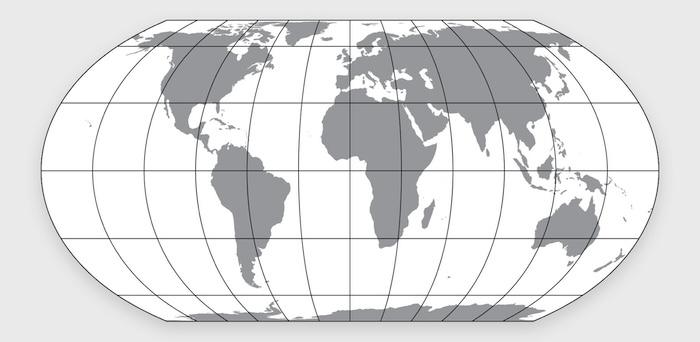
The alternative promoted by the resolution is the Equal Earth projection, designed in 2018 by cartographers Bojan Šavrič, Bernhard Jenny and Tom Patterson. It is an equal area map, meaning that every country and continent is shown at its correct proportional size relative to the others. Africa, South America and South Asia appear at their true scale, while the curved edges of the projection keep continental shapes recognisable.
What the resolution does and does not do
The resolution is not legally binding. It does not ban the Mercator map, which remains suited to maritime and aerial navigation, and it does not require any organisation to change its maps. Instead, it encourages governments, schools, international bodies and technology companies to adopt equal area projections such as Equal Earth.
Key concepts behind this shift
This vote touches on several concepts relevant to decolonisation and global equity.
Cartographic power and bias
Cartographic power is the use of map design to assert cultural or political dominance. Eurocentric bias refers to framing the world from a Western vantage point that overstates the significance of the global north.
Justice and agency
Spatial justice means ensuring geographic representation reflects real world proportions. Global south agency describes nations of the global south leading structural reform rather than waiting for it. Institutional equity involves reshaping systemic practices so all regions are represented fairly.
Education and diplomacy
Curricula reform means revising academic materials that were built on colonial era assumptions. Geopolitical accuracy is the representation of the physical scale of states without structural distortion. Multilateral diplomacy refers to nations working through bodies such as the UN to address long standing imbalances. Visual representation concerns how everyday imagery shapes public understanding of the world.
What institutions might do next
The resolution places the responsibility for change on the institutions that produce and distribute maps.
Universities and schools
Universities could update the maps used in geography, international relations and political science courses, and use this shift as a case study in how visual media carries assumptions. Schools and education boards could work with textbook publishers to bring equal area maps into classrooms, since children form much of their sense of global scale at an early age.
NGOs, media and technology
Non-governmental organisations working in development, climate and human rights could review the maps used in their own reports and materials. Media organisations and technology companies could incorporate the Equal Earth projection into news graphics, data visualisation and digital mapping tools, which would likely do more to shift public perception than any single textbook change.
Togo’s own timeline
Togo has said it intends to update its own school geography materials by the end of 2026 and plans to engage other governments and technology companies on wider adoption over the following months.
A look at global leaders in social work and development and where they can start
The institutional blindspot: the case of the IASSW logo
Cartographic bias is not limited to classrooms and newsrooms. It also appears in the branding of organisations that describe their own mission in terms of equity. The IASSW is one example. The organisation states that it works towards a decolonising agenda and aims to counter Western dominance in global education. Its logo uses an oval pseudocylindrical projection, a map style that distorts landmass proportions in the same way as the Mercator projection, reducing the visual size of the global south while enlarging the global north. This creates an inconsistency for an organisation built around social justice. It suggests that the UN resolution has relevance beyond governments and schools, extending also to organisations whose stated values depend on accurate representation. Aligning a logo with those values would mean auditing visual materials and updating branding to reflect the Equal Earth projection, so that the symbols an organisation uses match the principles it promotes.
Fractured perspectives: the IFSW branding contradiction
A similar inconsistency appears in the logo of the IFSW, the global body representing social workers and their work on human rights. The IFSW emblem splits the world into two separate circular globes, a design that distorts continental shapes and compresses Africa to fit within the frame. For a federation built around structural equality, a logo that visibly cuts off and reduces parts of the global south sits at odds with its stated commitments. The distortion is not a matter of artistic style alone. It repeats, in miniature, the same pattern the UN resolution was written to address. Adopting the Togo Equal Earth projection would allow the IFSW to replace a divided, colonial era map style with a single unified globe, bringing its visual identity closer to the spatial justice it advocates for in its work.
Shifting focus to the margins: the ICSW globe
The logo of the ICSW presents a further example of cartographic distortion. Its circular, globe style emblem centres the map in a way that pushes the global south to the edge of the frame, curving and compressing South America and Africa at sharp angles. This placement visually diminishes the regions that are most central to global development work. For the ICSW, an organisation whose mandate is to foster international cooperation and address systemic poverty, a map that structurally marginalises developing nations sits at odds with its purpose. Moving to the flat, undistorted view offered by the Equal Earth projection would give the communities the ICSW works with a more central and proportionate place in its own visual identity, rather than positioning them at the periphery.
Conclusion
Maps carry assumptions about scale and significance, whether or not this is intended. The UN vote does not compel any institution to change how it represents the world, but it gives formal international backing to the argument that accuracy in mapping matters. The examples of the IASSW, IFSW and ICSW logos show that this issue extends beyond governments and schools into the branding of the very organisations that speak in the language of equity and social justice. As leaders in the field, these bodies are well placed to act first, auditing their own visual identities and adopting the TEEP ahead of the wider institutions they encourage to follow.
Use the form below to subscibe to Owia Bulletin.